So you've got your art print, and now you need a frame. One problem, you need to choose a colour frame.
What's the best colour frame for your art print?
Choosing the right colour frame for your artwork is crucial in enhancing its visual impact and ensuring it complements your home decor.
The frame acts as a bridge between the art and its surroundings, and selecting the perfect shade can elevate the overall aesthetic.
We’ll explore how to choose the best colour frame for your art, considering factors like the artwork’s style, colour palette, and the room’s decor.
We’ll also touch on framing trends and tips for making your artwork the focal point of any room.
Understanding the Role of Colour in Framing

The Frame as an Extension of the Artwork
A frame is more than just a border. It’s an extension of the artwork itself.
The colour of the frame should either harmonise with the art or provide a contrasting edge that highlights certain elements within the piece.
It’s important to consider how the frame colour interacts with the colours in the artwork, as well as how it integrates into the overall decor of the room.
Creating Balance and Focus
The right frame colour can draw attention to the art without overwhelming it.
For instance, neutral frames like black, white, or natural wood tones are timeless choices that tend to complement most artworks.
On the other hand, bold or colourful frames can be used to create a striking contrast, particularly in modern or eclectic spaces.
Factors to Consider When Choosing a Frame Colour

The Artwork’s Colour Palette
Start by analysing the dominant colours in your artwork. A frame that echoes one of the key colours can create a harmonious look.
Alternatively, a contrasting frame colour can make specific elements in the artwork pop, adding visual interest.
Monochromatic Art: For black and white or monochromatic pieces, a black, white, or grey frame can create a sleek, modern look.
For a softer approach, consider a natural wood frame.
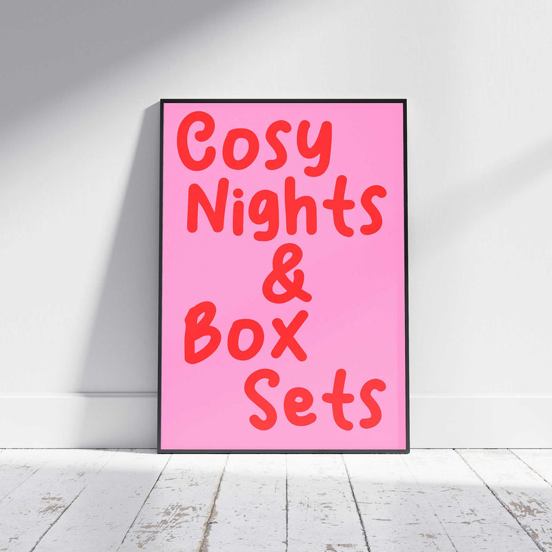
Vibrant Artwork: If the art features bold, vibrant colours, such as Veranito colourful typography prints, a neutral frame might be the best choice to avoid competing with the artwork.
However, if you want to make a statement, choose a frame that picks up a secondary colour from the piece.
Pastel Tones: Light-coloured artwork often pairs well with white or soft-coloured frames, enhancing the delicacy of the piece without overshadowing it.
Matching the Frame to the Room’s Decor
Consider the existing colour scheme and style of the room where the artwork will be displayed.
The frame should complement the decor, whether by matching the room’s tones or by introducing a subtle contrast that adds depth.
Traditional Spaces
In a classic or traditional room, gold, bronze, or dark wood frames can add a touch of elegance and formality.
Modern Interiors
Sleek black, white, or metallic frames often work well in contemporary settings, offering a clean, minimalist look.
Eclectic Rooms
For an eclectic or bohemian space, don’t be afraid to mix frame colours and styles. Brightly coloured frames or ornate designs can add character and charm.
Considering the Artwork’s Medium and Style
The medium and style of the artwork can also guide your frame colour choice.
For example, oil paintings often look striking in gold or wooden frames, which enhance their traditional appeal.
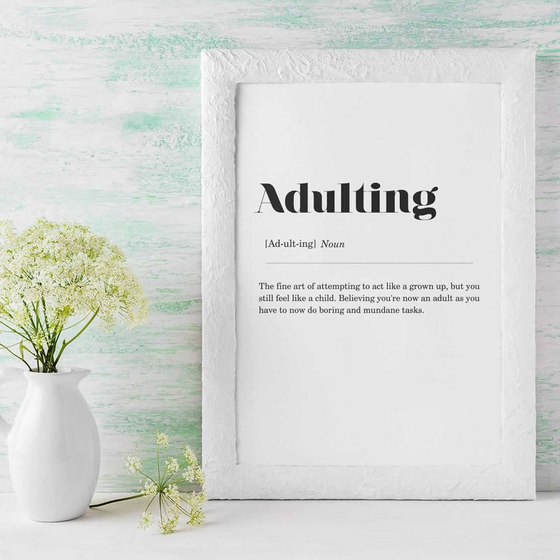
In contrast, photographs, abstract art, or digital prints may benefit from the simplicity of a black or white frame, which doesn’t detract from the image.
The Impact of Matting

Matting, or the border placed between the artwork and the frame, can also influence your frame colour choice.
A white or cream mat is a classic option that can make the artwork appear more prominent, while coloured mats can introduce an additional layer of colour coordination.
When using a mat, the frame colour can either match or contrast with the matting for different effects.
Popular Frame Colour Trends
Black Frames
Black frames are versatile and timeless, working well with almost any style of artwork.
They’re particularly effective for adding a sense of drama and focus, especially with brightly coloured or high-contrast pieces.
White Frames
White frames offer a clean, modern aesthetic that’s perfect for minimalist or Scandinavian-inspired interiors.
They can make artwork feel fresh and contemporary, especially when paired with lighter, airy pieces.
Wood Tones

Natural wood frames bring warmth and texture, making them a popular choice for everything from rustic to mid-century modern decor.
The tone of the wood—whether light oak, rich walnut, or painted wood—can dramatically affect the mood of the room.
Gold and Metallic Frames
Gold, silver, or bronze frames add a touch of luxury and are often used to frame traditional art, portraits, or mirrors.
These frames can make a space feel more opulent and are ideal for formal settings.
Colourful Frames
For a bold statement, colourful frames can enhance playful, contemporary, or pop art.
Choose a frame that either matches a key colour in the artwork or contrasts with it for a vibrant, eye-catching look.
Practical Tips for Choosing Frame Colours
Test Before Committing
If possible, hold up different frames against the artwork before making a final decision.
Many frame shops allow you to see how different options will look before committing to a purchase.
You can also use online tools that let you visualise different frames with your artwork.
Consider the Lighting
The lighting in the room can affect how the frame colour appears. Natural light may bring out different tones in the frame compared to artificial lighting.
Consider the room’s lighting when selecting your frame to ensure it looks good at all times of the day.
Mix and Match
If you have multiple pieces of art in the same room, don’t be afraid to mix and match frame colours.
Just make sure there’s some cohesion. Whether through the style of the frames or the overall colour scheme of the room.
On That Note
Choosing the best colour frame for your art involves balancing the artwork’s colours, the room’s decor, and your personal style.
Whether you opt for a classic black or white frame, a warm wood tone, or a bold colour, the right frame can enhance your art and create a cohesive look in your space.
Take the time to explore different options, and don’t be afraid to experiment until you find the perfect match.
With these tips in mind, you’ll be well on your way to framing your art beautifully and making it a true focal point in your home.